Project summary
Trengo is an AI-powered customer engagement platform that helps businesses manage conversations across different channels. As the product evolved and expanded, it became increasingly important to maintain consistency across interfaces, reduce design and development overhead, and improve collaboration across teams.
The problem
When I joined Trengo, the UI landscape was fragmented. Several product areas were running on legacy Bootstrap components, creating visual inconsistencies and an outdated user experience. Teams were developing custom one-off solutions across products, making the front-end difficult to maintain and scale.
Designers faced significant challenges too. Without a shared design vocabulary or system, designers had limited control over how their work was implemented, which led to frequent misalignments with engineers. As a result, feature development moved slowly, and product teams were becoming increasingly disconnected from each other.
It was clear we needed to bring structure to the front-end architecture and support better collaboration across teams.
My role
I led the engineering efforts behind Trengo’s internal design system, with responsibility for both the technical implementation and the cross-functional processes that supported it. My focus included building and maintaining the component library, contributing to component design decisions, shaping how tokens were structured and applied, and guiding architectural direction.
Beyond that, I contributed to product UI development, particularly for features that helped validate the components I had built. This work provided a feedback loop between real-world usage and ongoing improvements in flexibility and usability.
To support adoption and cross-team alignment, I introduced structured workflows for component proposals, ran weekly syncs between design and engineering, and organized knowledge-sharing sessions. I also helped define and promote the “Design System Ambassador” role, which gave individual product teams clearer ownership and involvement.
The goal wasn't just to build scalable infrastructure, but to make sure it worked for the people using it every day.
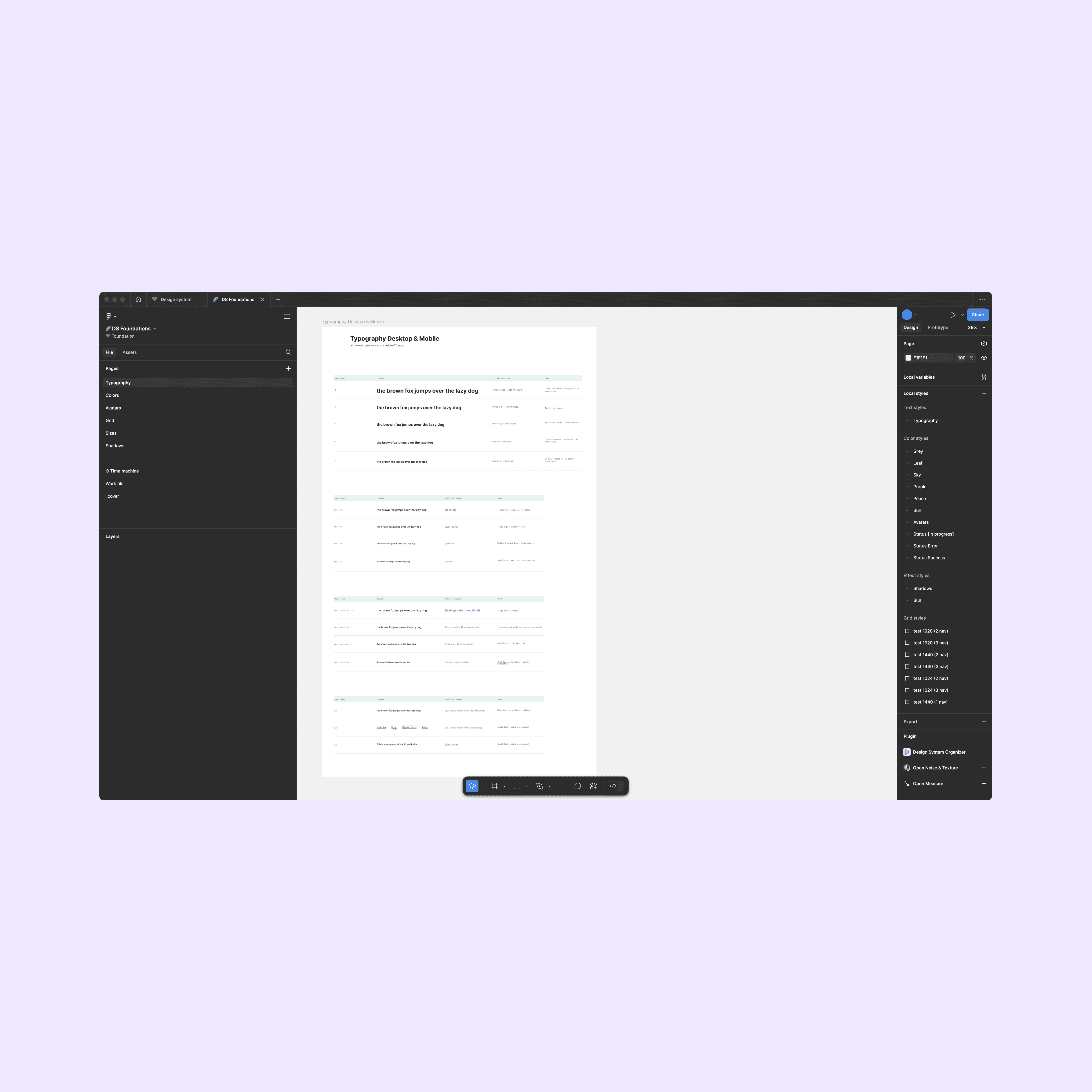
Design tokens and foundations
One of the first steps in building the design system was defining its foundation: colours, typography, spacing, and other design tokens. I worked closely with the design team to translate these foundations into usable tokens that could be consistently applied across products.
We used Tailwind as our base, customizing its configuration to match the design tokens exactly. I helped unify naming conventions between Figma and code so that both designers and engineers were speaking the same language, making handoff and collaboration much smoother.
Having these tokens in place made it easier to theme components, enforce visual consistency, and centralize updates. If a value needed to change, like spacing or a color, it could be done once and automatically reflected throughout the platform.
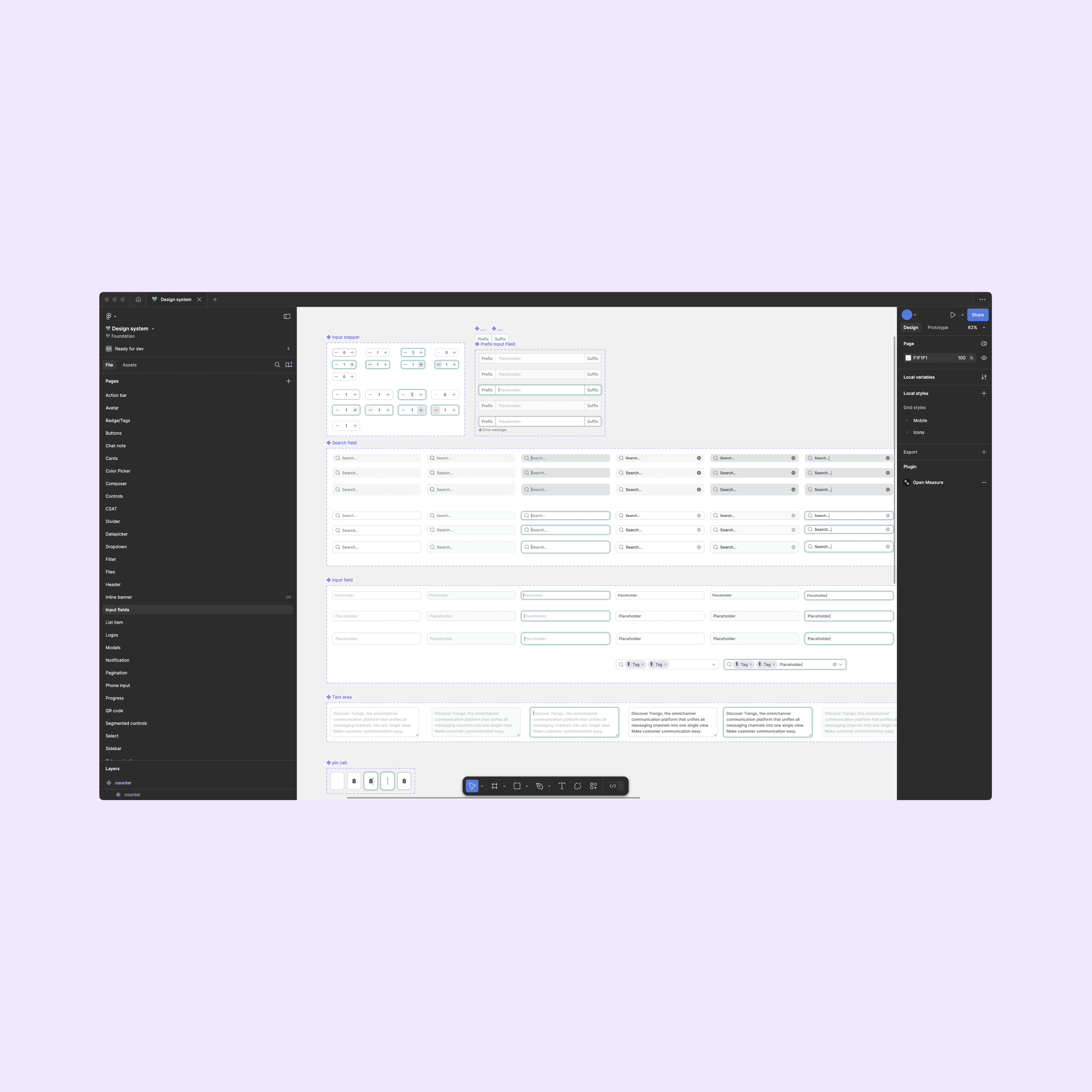
Component architecture
The component library was built to support consistent, reusable UI across the platform. It included elements such as buttons, inputs, banners, modals, and a multi-digit code input. Each component supported multiple states and configurations, giving teams the flexibility to implement them without creating custom solutions.
Component structure and behavior were defined through direct collaboration between myself and the design team. I was involved early in the process, providing feedback on designs, identifying edge cases, and making sure each component was accessible, scalable, and aligned with real use cases. These discussions helped simplify component APIs and reduce unnecessary complexity before implementation even began.
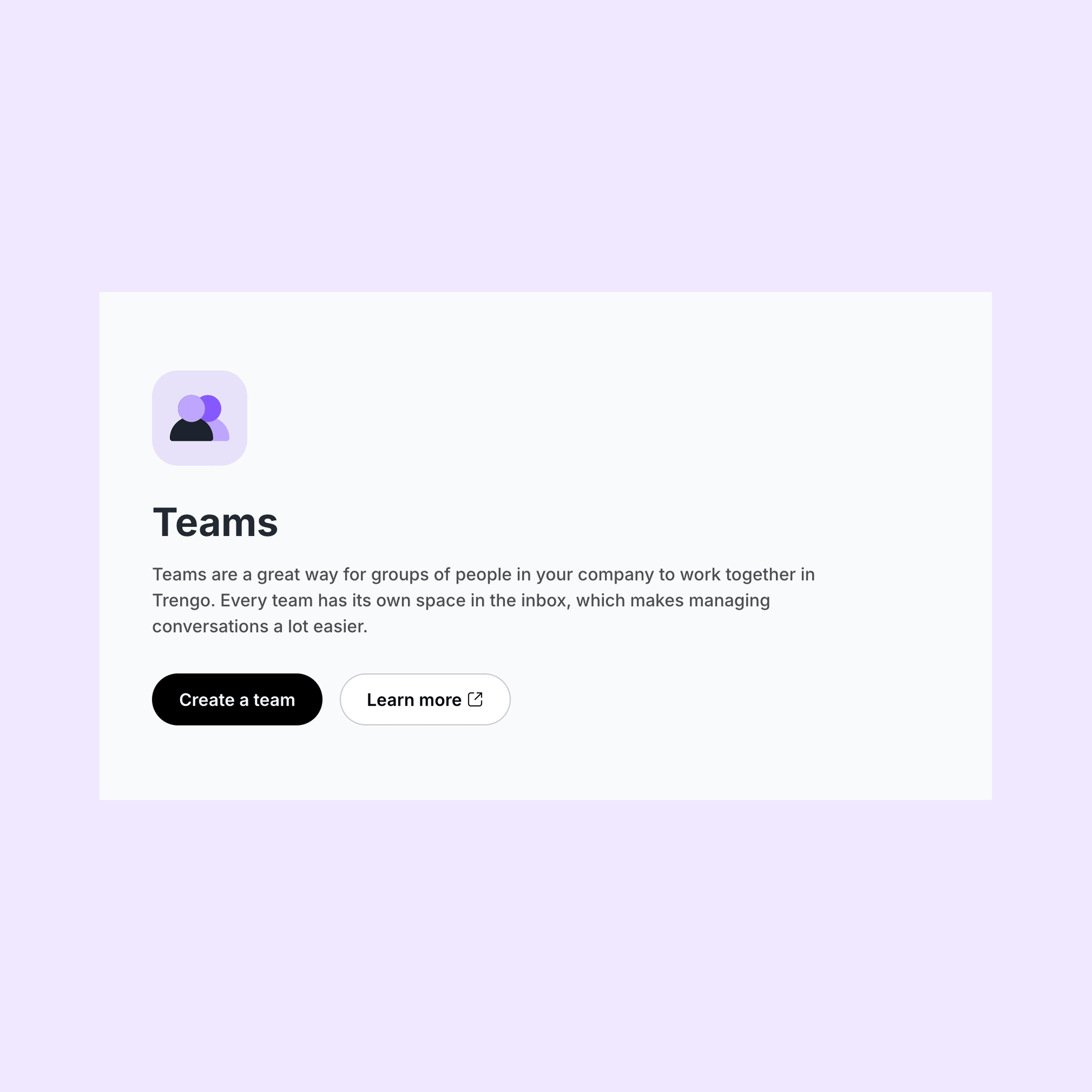
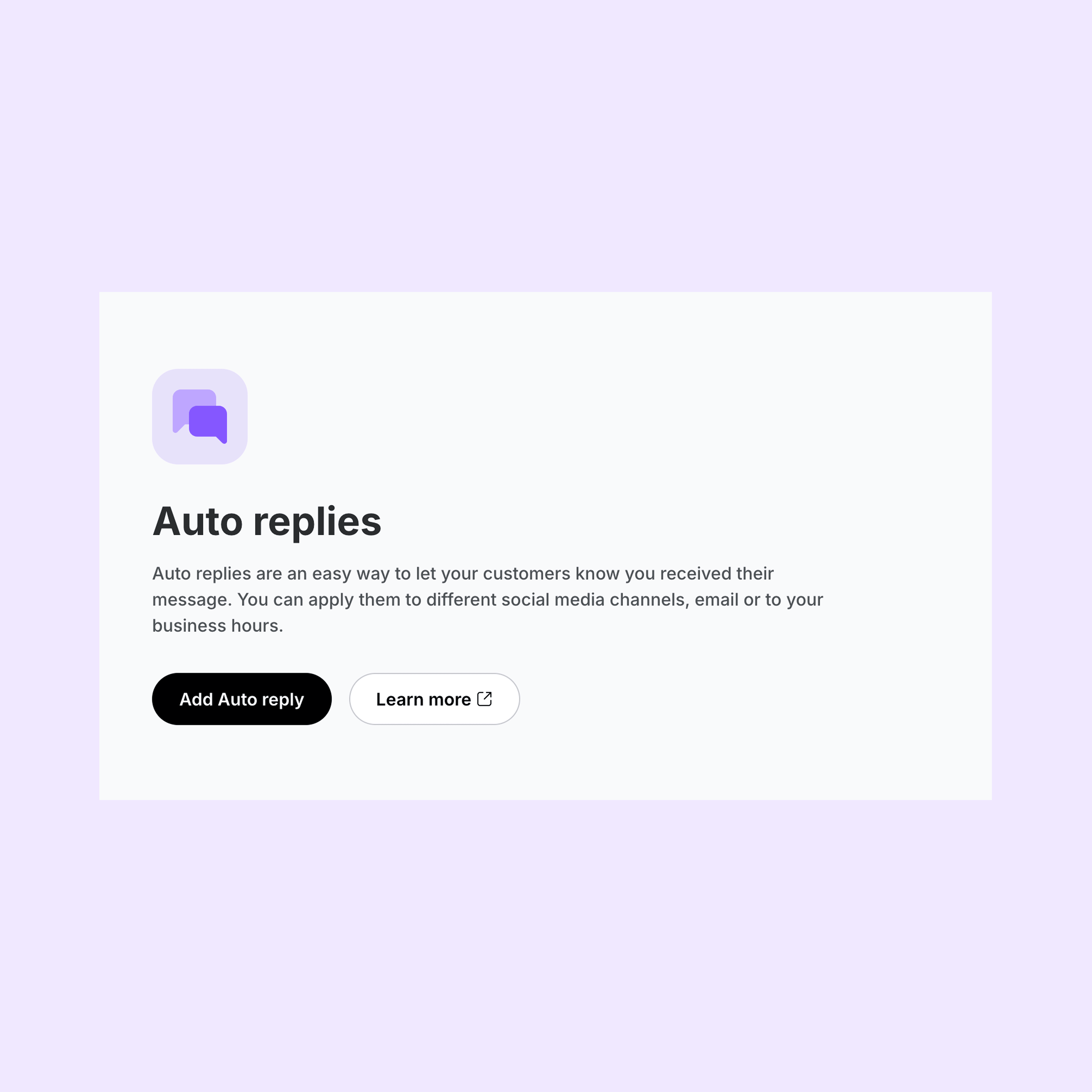
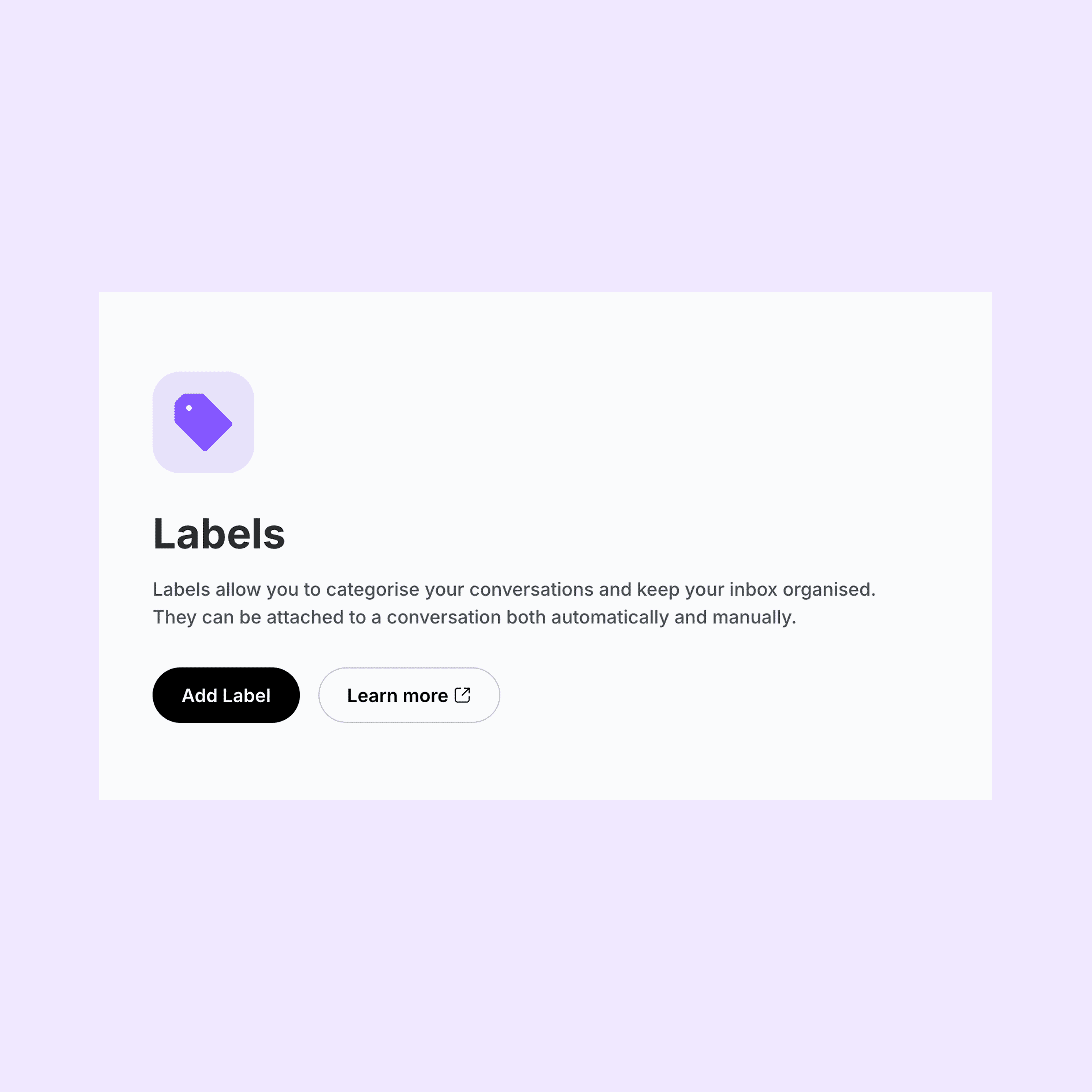
In addition to standalone components, I helped implement and standardize shared UI patterns across the platform. One example was the settings landing page layout, which included an icon, title, description, and two actions. I implemented it using components from the library, turning it into a repeatable pattern that could be used across the platform.
To maintain quality and avoid duplication, I worked with the design team to introduce a review process for new component proposals. It made it easier to evaluate whether something served a broad enough use case to belong in the design system and helped keep the library focused and scalable.
Documentation and tooling
Documentation for the design system was built with both designers and engineers in mind. While the design team maintained guidelines around usage rationale and visual language, I focused the technical documentation on aspects like how components functioned, implementation methods, and expected behavior. I set up Storybook as the main reference point for engineers, giving them live examples of component states, usage patterns, and guidance.
To maintain quality and visual consistency, I introduced Chromatic into our development workflow. This gave us a way to run visual regression tests, create isolated component previews, and establish a shared review process that both designers and engineers could participate in.
The design system was initially maintained in a monorepo, but was later moved to a standalone npm package through a collaborative engineering effort, in order to support a micro-frontend architecture. As part of that work, we set up a CI/CD pipeline to automate publishing, versioning, and changelog generation. Releases followed a semantic versioning strategy (patch, minor, major), triggered automatically based on version tags. This removed manual steps from the release process and made it easier for teams to stay up to date with the latest version. Unit tests were written with Jest and integrated into the pipeline to ensure components behaved reliably across updates.
Outcome and impact
The design system brought structure and consistency to areas of the product that had previously relied on one-off implementations and legacy UI. It reduced visual and technical debt across teams, improved collaboration between design and engineering, and made it easier to build new features without starting from scratch each time.
Component reuse became the default, not the exception. Teams could move faster with fewer design reviews, and design decisions were more consistently reflected in production. The shared language and documentation created less back-and-forth, and the integration of tools like Storybook and Chromatic gave everyone better visibility into what was available and how it worked.
One example of this in practice was a feature for configuring user roles and permissions. I built the modal entirely using components from the design system. It brought together different states, inputs, buttons, and layout logic in a way that felt seamless to users and simple to maintain for developers. It also served as a model for how future features could be built more efficiently.
Reflection
Working on the design system gave me space to think beyond implementation and focus on the bigger picture: consistency, scalability, and how teams actually work together. I learned how much structure and clarity matter, not just in code, but in communication, documentation, and the way people interact with tools, processes, and the product itself.
One of the more complex challenges was maintaining the right balance between flexibility and consistency. Product teams often had different needs, and it took ongoing effort to keep the library focused without blocking progress. Creating structure around proposal reviews, feedback loops, and shared ownership helped turn that into a collaborative process that supported scale rather than slowing it down.
One thing I'm particularly proud of is how the design system became a connection point between disciplines. It wasn't just a collection of components, it genuinely changed how designers and engineers collaborated, made decisions, and shared ownership of the product.